
A compliant evacuation route map shows a primary exit path, a secondary route in case the first is blocked, a “You are here” marker oriented to match the viewer’s position, an outdoor assembly point, and the location of nearby fire extinguishers or pull stations. That’s the whole test. If a map is missing any of those five things, it isn’t finished, no matter how polished it looks.
Here’s what belongs on every posted map:
- Primary and secondary exit routes, drawn as arrows, never overlapping
- A “You are here” marker that matches the actual orientation of the wall it’s mounted on
- At least one outdoor assembly point marked outside the building footprint
- Fire extinguisher, pull station, and stairwell icons
- A short legend explaining colors and symbols
- ADA-accessible route markings where they diverge from standard paths
- Elevator “do not use” notation
Once you’ve got those elements sorted, the fastest path forward is copying one of the annotated examples further down this page and adapting it to your floor plan. Expect to work in editable PDF, Microsoft Visio, or DWG/CAD formats if an architect is involved, and export a flattened PNG or JPEG for the version you actually post on the wall.
Key Takeaways
A fire evacuation route map only works if it shows two verified exit routes, an accurately oriented “You are here” marker, and an outdoor assembly point, and stays current after every layout change.
| Point | Details |
|---|---|
| Five non-negotiable elements | Primary route, secondary route, oriented “You are here,” assembly point, and equipment locations must all appear on every map. |
| Two exits are the baseline | OSHA generally requires at least two remote exit routes per floor, absent a documented exception. |
| Build floor-specific maps | Multi-floor buildings need a separate map per floor, not one combined diagram for the whole building. |
| AHJ has final authority | Local fire marshals often apply stricter conditions than OSHA or NFPA minimums, so get sign-off before permanent posting. |
| Revise after any layout change | Outdated “You are here” markers after renovations are a leading cause of inspection rejections. |
| Get professional map review | Pre Action Fire’s NICET-certified technicians review, draft, and support AHJ submittal for evacuation route maps across the Denver Metro Area. |
Table of Contents
- Fire Evacuation Route Examples: What Every Map Needs
- What Do OSHA and NFPA Require for Exit Routes?
- How Do You Turn a Floor Plan Into an Evacuation Map?
- Three Evacuation Route Examples for Different Building Types
- Which Templates and Tools Make Building a Map Easier?
- How Do You Account for Occupants Who Need Assistance?
- Posting, Training, and Keeping Maps Current
- A Printable Checklist and Copyable Map Template
- Why Do Fire Marshals Reject Evacuation Maps?
- A Note From the Field
- Get Your Evacuation Map Reviewed and Certified
- Sources
Fire Evacuation Route Examples: What Every Map Needs
The five must-have elements above are the floor, not the ceiling. A map that passes a walkthrough but confuses an occupant during an actual fire has failed at its real job. The OSHA eTool for evacuation plans lays out the fuller list of diagram elements worth including on any serious fire evacuation route map:
- All exits, clearly labeled, including ones occupants don’t normally use
- Primary route arrows in one color, secondary route arrows in a distinct second color
- “You are here” positioned and rotated to match the reader’s actual vantage point
- One or more assembly points, located away from the building and clear of fire lanes
- Fire extinguisher and pull station icons at their real physical locations
- Stairwell identification, especially in multi-floor buildings where stairwells look identical from the inside
- Elevator icons marked “Do Not Use” in a fire
- ADA-accessible routes and refuge areas, marked distinctly from standard paths
- Hazard zones (chemical storage, mechanical rooms, high-voltage areas) shaded or flagged so routes visibly avoid them
A legend turns a diagram into something a stranger can read in five seconds under stress. Keep it simple: a solid green line for the primary route, a dashed orange line for secondary, a red icon for extinguishers, a blue wheelchair symbol for accessible paths, and a hazard triangle for anything dangerous. Four or five symbols is plenty. Legends with fifteen icons get ignored.
Readability matters more than most facility owners assume. A map printed at the wrong scale, in 8-point font, mounted behind a door that swings open, does nothing for anyone. Orient the “You are here” marker so it matches the direction the occupant is actually facing when they read it. That single detail is one of the most common reasons AHJ reviewers send maps back. Print or mount at a size where room labels are legible from three feet away, use high-contrast colors (dark ink on a light background, not the reverse), and mount every copy at eye level, roughly 48 to 60 inches from the floor, in the same spot on every floor so people build muscle memory.
Accessibility isn’t a footnote. If your building has occupants who use wheelchairs, walkers, or have vision impairments, the map needs to show areas of rescue assistance, evacuation chair storage, and any refuge area where an assisted occupant should wait for help. Braille or large-print versions belong near primary entrances in buildings that serve the public. Show the accessible route as a distinct line style, not just a note in small text at the bottom.
Pro Tip: Test your map’s readability by standing at the exact spot where it’s mounted and asking someone unfamiliar with the building to trace the primary route with their finger in under ten seconds. If they hesitate or trace the wrong direction, the map needs revision before it needs posting.
Good exit signage works alongside the map, not instead of it. A map tells occupants the full path; signage confirms they’re still on it at each decision point.
What Do OSHA and NFPA Require for Exit Routes?
Every evacuation route map you draw has to sit inside a set of hard constraints, and those constraints come from two sources: OSHA’s federal exit route standards and NFPA 101, the Life Safety Code that most local fire codes are built around.
OSHA’s design and construction requirements for exit routes set the baseline. Most workplaces need at least two exit routes, positioned far enough apart that a single fire or blockage can’t take out both at once. Exit routes must be permanent, meaning you can’t route people through a space that gets used for temporary storage. Doors along the route have to be unlocked from the inside, wide enough for the occupant load, and discharge directly to the outside, a public way, or a safe area. Ceiling heights along the route generally need to clear 7 feet 6 inches, and route width has to accommodate the number of people expected to use it during peak occupancy.
Maintenance matters just as much as design. Under OSHA’s maintenance and operational rules for exit routes, routes must stay free of obstructions at all times, lighting has to remain functional, exit signs need to stay visible and illuminated, and alarm systems must be operable. A route that was compliant on installation day but now has boxes stacked in the corridor is not compliant. That’s an inspection failure waiting to happen, and it’s one of the easiest things to fix before a fire marshal ever shows up.
NFPA 101 layers in more specific design math. Occupant load determines how many exits a space actually needs. Below certain occupant thresholds, one exit may be technically allowed, but most commercial and industrial spaces cross that threshold fast, especially once you count storage, mechanical, and back-of-house areas. NFPA 101 also caps travel distance, the total distance someone can walk before reaching an exit, and limits dead-end corridors to a fixed length so nobody gets trapped in a hallway with no way out. Door swing direction matters too. Any door serving 50 or more occupants must swing in the direction of egress travel, so it can’t become an obstruction during a crowd exit.
Rule of thumb: minimum exit route width is typically 28 inches, ceiling height along the route generally needs to clear 7 feet 6 inches, and OSHA generally requires at least two remote exit routes for most workplaces. Always confirm exact figures against your occupancy classification and local code.
None of this replaces your local Authority Having Jurisdiction. The AHJ, usually your local fire marshal, has the final say and often applies stricter conditions than the federal minimum, especially in older buildings, high-occupancy spaces, or facilities with unusual layouts. Treat OSHA and NFPA as the floor, not the finish line. Before you post anything permanently, run it past whoever has jurisdiction over your building.
The Emergency Action Plan requirement also matters here, because your map doesn’t stand alone. OSHA requires a written plan that assigns evacuation responsibilities and exit route procedures, and the map is the visual companion to that document, not a replacement for it.
How Do You Turn a Floor Plan Into an Evacuation Map?
Start with what you already have, not a blank page. Most facilities already own a floor plan from construction, leasing, or a prior inspection. Use it as your base layer instead of redrawing the building from scratch.
- Gather the existing floor plan. Pull the most current version from your property manager, architect, or building owner. If none exists, sketch a rough scaled layout yourself, room by room.
- Walk every route in person. Don’t design from memory. Walk each proposed exit path, confirm doors open the way you expect, and check that stairwells connect where the drawing says they do.
- Mark hazards and equipment on the walk. Note extinguisher locations, pull stations, electrical rooms, chemical storage, and anything that should never sit along an evacuation path.
- Draw the primary route first. Pick the shortest safe path to an exterior exit from each area of the floor. Shortest doesn’t always mean straightest. Avoid routing people past hazard zones even if it adds a few feet.
- Add at least one secondary route. This is the redundancy that matters most when smoke or fire blocks the primary path. A map with only one route is a map that fails the moment something goes wrong.
- Orient the “You are here” marker. Match it to the physical direction the person is facing when they view the posted copy, not to how the drawing looks on your screen.
A few things separate a usable map from a frustrating one. Keep your scale consistent across every floor of a multi-floor building, so staff moving between floors read the same visual language every time. Use arrowheads that are large enough to see from several feet away, color code primary versus secondary routes the same way on every floor, and label rooms with names people actually use, not internal file numbers nobody recognizes. Every floor needs its own map. A single building-wide map that tries to show three floors at once is unreadable and functionally useless during an emergency.
Before anything goes on the wall, run these checks:
- Does the floor have at least two remote exits, unless a documented code exception applies?
- Do all exit doors open the correct direction and remain unlocked from the inside during occupied hours?
- Is any dead-end corridor within the length NFPA 101 allows for your occupancy type?
- Does the primary route avoid all marked hazard zones?
- Is the “You are here” marker correctly oriented for the exact spot where the map is mounted?
- Have you cross-checked the map against your written evacuation plan so procedures and the visual match?
Once those boxes are checked, the map is ready for AHJ review, not final posting. Get that sign-off before treating any draft as permanent.
Three Evacuation Route Examples for Different Building Types
Reading a list of requirements only gets you so far. Seeing how those requirements play out in an actual building type makes the pattern click. Here are three annotated examples you can adapt directly.
Example A: Small single-floor office
Picture a 4,000 square foot office with one main entrance, a rear loading door, and a single open floor plan split into workstations, two conference rooms, and a break room. The primary route runs from the farthest workstation straight to the main entrance, roughly 65 feet of open corridor. The secondary route sends the same occupants toward the rear loading door instead, which sits about 80 feet away but avoids the break room, where a kitchen fire risk is highest.
Why this layout: the primary route is the shortest safe path; the secondary route deliberately routes around the higher-risk kitchen zone even though it’s longer.
What to watch for: the rear loading door needs a panic bar and must stay unlocked from the inside during business hours, or the whole secondary route collapses on paper.
Copyable caption: “Primary Exit: Front entrance, 65 ft. Secondary Exit: Rear loading door, 80 ft. Assembly Point: North parking lot, past the flagpole. Extinguisher: Break room wall, east side.”
Example B: Multi-floor commercial building
A five-story office building needs a separate map for every single floor, each showing that floor’s specific exits, stairwells, and assembly staging. Stairwell identification becomes critical here because Stairwell A and Stairwell B often look identical from inside, and confused occupants waste time backtracking. Elevators get a hard “Do Not Use” marking on every floor map, with an arrow redirecting to the nearest stairwell instead.
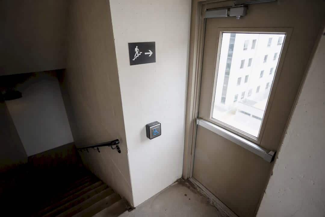
Why this layout: floor-specific maps prevent someone on the fourth floor from following directions meant for the ground floor lobby.
What to watch for: vertical evacuation notes matter for occupants with mobility limitations; each floor map should mark the nearest area of rescue assistance, since those occupants may need to wait for fire department assistance rather than use the stairs.
Copyable caption: “Floor 4 Primary Exit: Stairwell A, east corridor. Secondary Exit: Stairwell B, west corridor. Do Not Use Elevators. Assembly Point: Plaza level, south side of building.”
Example C: Industrial or high-hazard facility
A warehouse with a loading dock, forklift traffic, and a chemical storage room needs egress corridors wide enough to handle both foot traffic and equipment movement during a rushed evacuation. Routes here have to actively avoid hazard zones rather than simply pass near them, consistent with OSHA’s guidance on high-hazard travel paths. Extinguisher placement follows hazard class, meaning a Class B extinguisher sits near flammable liquid storage, not just wherever’s convenient.

Why this layout: wider corridors accommodate both people and equipment; hazard-avoidant routing keeps evacuees from passing through the highest-risk section of the building even if it lengthens the walk.
What to watch for: loading dock doors often stay open during shifts for equipment access, which can create false confidence about egress capacity that disappears the moment the dock door closes for the night.
Copyable caption: “Primary Exit: North dock door, clear of forklift lane. Secondary Exit: East personnel door. Avoid Zone: Chemical storage, Bay 3. Class B Extinguisher: Bay 3 entrance.”
Which Templates and Tools Make Building a Map Easier?
You don’t need to draft a map from scratch every time. A handful of formats and tools cover almost every facility’s needs, and picking the right one saves hours.
For quick, low-cost posting, an editable PDF template works fine, especially for single-floor buildings without complex layouts. Diagramming tools like SmartDraw’s fire escape plan templates give you drag-and-drop symbols that already follow standard evacuation-map conventions, which speeds things up considerably if you’re not starting from an existing architectural drawing. Microsoft Visio serves a similar purpose for facilities that already have Visio licenses and want more manual control over layout and symbol placement.
If your building has an architect of record, ask for the floor plan in DWG or CAD format. That gives you precise measurements and scale accuracy that a hand-traced PDF can’t match, particularly important for larger commercial or industrial facilities where travel distances actually need to be calculated, not estimated. Once the CAD drawing is finalized, export a flattened, high-resolution PNG or JPEG for the version that actually goes on the wall. Nobody needs to open AutoCAD to read a posted evacuation map.
Keep two versions of every map: an editable master file stored somewhere your facilities team controls, and a static posted copy on the wall. When you update the master after a renovation, that update has to make it onto every posted copy, not just the file on someone’s desktop. A dated version stamp in the corner of every posted map, however small, makes it obvious at a glance whether a copy is current.
Whatever tool you use, stick to symbol conventions that match OSHA and NFPA norms rather than inventing your own icon set. A reviewer who’s seen a hundred maps recognizes the standard green arrow, red extinguisher icon, and blue wheelchair symbol instantly. A custom icon set slows down every review, including your own AHJ inspection.
How Do You Account for Occupants Who Need Assistance?
Evacuation maps that ignore mobility, vision, or hearing limitations aren’t finished maps, they’re incomplete ones. Show accessible routes as a visually distinct line style, and mark every area of rescue assistance and evacuation chair storage location directly on the diagram, not in a footnote.
Assign wardens for each floor or zone, people trained on the full floor layout who can verify all occupants are out and confirm fire doors close properly behind them during an exit. Show this role on the plan itself, not just in a separate personnel document, so a substitute or new hire can find the assignment quickly.
- Mark ADA-accessible routes with a distinct color or line style, separate from standard primary and secondary paths
- Flag areas of rescue assistance where mobility-impaired occupants should wait for help
- Note evacuation chair storage locations directly on the floor map
- Include a short instruction line: “Assist mobility-impaired occupants to nearest Area of Rescue Assistance. Do not use elevator. Alert responding fire personnel of their location.”
Pro Tip: Coordinate directly with your local AHJ and building management before finalizing refuge area locations. What counts as an acceptable area of rescue assistance often varies by jurisdiction, and getting that answer wrong on paper means redoing the map after the fact.
Posting, Training, and Keeping Maps Current
A perfect map that nobody sees or trains on accomplishes nothing. Post copies at every building entrance, elevator lobby, stairwell door, break room, and near every alarm pull station. Long corridors need their own posted copy roughly every 100 feet so nobody has to backtrack to check their route.
Mount every copy consistently, roughly 48 to 60 inches from the floor, with the “You are here” marker rotated to match that exact viewing position. Keep the area around every posted map completely unobstructed, and confirm the space stays lit even during a power interruption.
- Brief new employees on evacuation routes during onboarding, before their first shift
- Run drills at least semi-annually, more often for high-occupancy or high-hazard facilities
- Review every posted map annually, even without a known building change
- Trigger an immediate review after any renovation, partition change, or furniture layout shift
A simple maintenance checklist keeps drift from creeping in: confirm exit lighting still functions, confirm routes remain physically clear, confirm signage is still legible from a normal viewing distance, and confirm the map itself reflects the current layout. Fire exit maintenance is one of the most commonly skipped tasks in facility management, mostly because nothing visibly breaks until an inspection catches it.
A Printable Checklist and Copyable Map Template
Before posting any map, run through this preflight list: confirm two exit routes exist per floor, confirm the “You are here” marker orientation matches its physical mounting location, confirm the assembly point sits clear of fire lanes, confirm ADA routes are marked distinctly, and confirm a version date appears somewhere on the printed copy.
Here’s a short template block you can adapt and paste beneath any posted map:
[Facility Name] — Floor [Number]
You are here: [marker matches physical orientation]
Primary Exit: [location and direction]
Secondary Exit: [location and direction]
Assembly Point: [outdoor location]
Emergency Contact: [building management or security number]
Version Date: [MM/YYYY]
For legend symbols, keep it minimal: a solid line for primary route, a dashed line for secondary, a red icon for extinguishers and pull stations, a blue wheelchair icon for accessible paths, and a shaded zone for hazards. Print in color when possible; contrast is what makes a map readable during a stressful moment, not a calm afternoon review.
Why Do Fire Marshals Reject Evacuation Maps?
After years of supporting AHJ submissions across commercial and industrial buildings in the Denver Metro Area, a few rejection patterns show up over and over. Missing assembly points top the list, closely followed by inconsistent “You are here” orientation between the map and its actual mounting wall. A map showing only one exit route, with no documented code exception, gets sent back almost every time.
When you submit to your fire marshal, bring more than the map itself. Include scale notes, equipment certification documentation for extinguishers and alarm systems, and be ready to walk the physical route with the inspector if asked. A physical walkthrough resolves disputes faster than any amount of back-and-forth over a drawing.
Pro Tip: If your building’s occupancy classification or layout is unusual, bring in a NICET-certified technician or licensed designer before you submit anything. A properly documented map with certified backup rarely gets bounced twice, and it usually moves through review faster than a self-drafted one.
A Note From the Field
Pre Action Fire has worked on fire protection systems across the Denver Metro Area since 2009, and our NICET-certified technicians review evacuation route maps as part of that work more often than most people expect. The maps that pass review on the first try are almost always the ones built from an actual site walkthrough, not a desk drawing. If you’re not confident your current map would survive an AHJ visit, that’s usually a fixable problem, not a rebuild-from-scratch one. Our guide to fire safety zones covers layout considerations in more depth if you want to go further before requesting a review.
Get Your Evacuation Map Reviewed and Certified
Drawing the map is one project. Getting it certified, submitted, and paired with the alarm and signage systems that back it up is another, and that’s where most facility teams run out of time or in-house expertise.

Pre Action Fire supports the full path from draft to posted map: professional drafting in CAD or Visio when your architect’s drawings need translating into a postable format, AHJ submittal support so you’re not walking into a fire marshal meeting alone, and signage supply and installation once your routes are finalized. We also connect route maps to the alarm systems that trigger the evacuation in the first place, since a map is only as useful as the alarm that tells people to use it. If your building’s fire alarm system needs a compliance check alongside your evacuation plan, that’s a natural next step to bundle together. Our fire safety inspection services also cover the maintenance side, catching the obstructed exits and dead signage that turn a compliant map into a failed inspection months later. Request a map review or schedule a site visit, and we’ll tell you exactly what stands between your current draft and a posted, AHJ-approved evacuation route map.
Sources
- 1910.36 – Design and construction requirements for exit routes. | Occupational Safety and Health Administration
- eTool : Evacuation Plans and Procedures – Emergency Action Plan – Evacuation Elements | Occupational Safety and Health Administration
Always get final sign-off from your local fire marshal before posting any map permanently.